The Product(s)
Windward is a data-driven maritime analytics platform that gives powerful insights into what happens in the sea.
Through Artificial Intelligence and maritime expertise, Windward analyse vessels' behaviour and help maritime Government or private decision-makers to spot unusual patterns or activities. Users can search for specific vessels or browse the sea and this way be proactive.
Search for vessels & companies
Search and investigation plays a central role in monitoring the sea worldwide. In fact, it became a business motivation to improve its performance and add capabilities to the feature (searching for vessels AND companies).
Without disrupting but improving basic UX fundamentals, adding missing capabilities and aligning with a more updated design, the new search feature got successfully shipped.
Focus and improvements
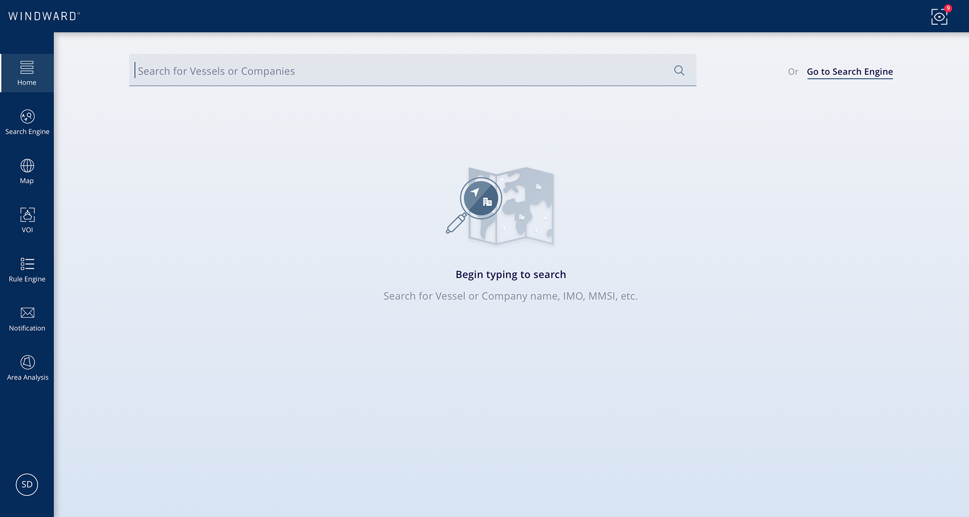
* Search is the main goal: Active by default and increases in its importance on the page
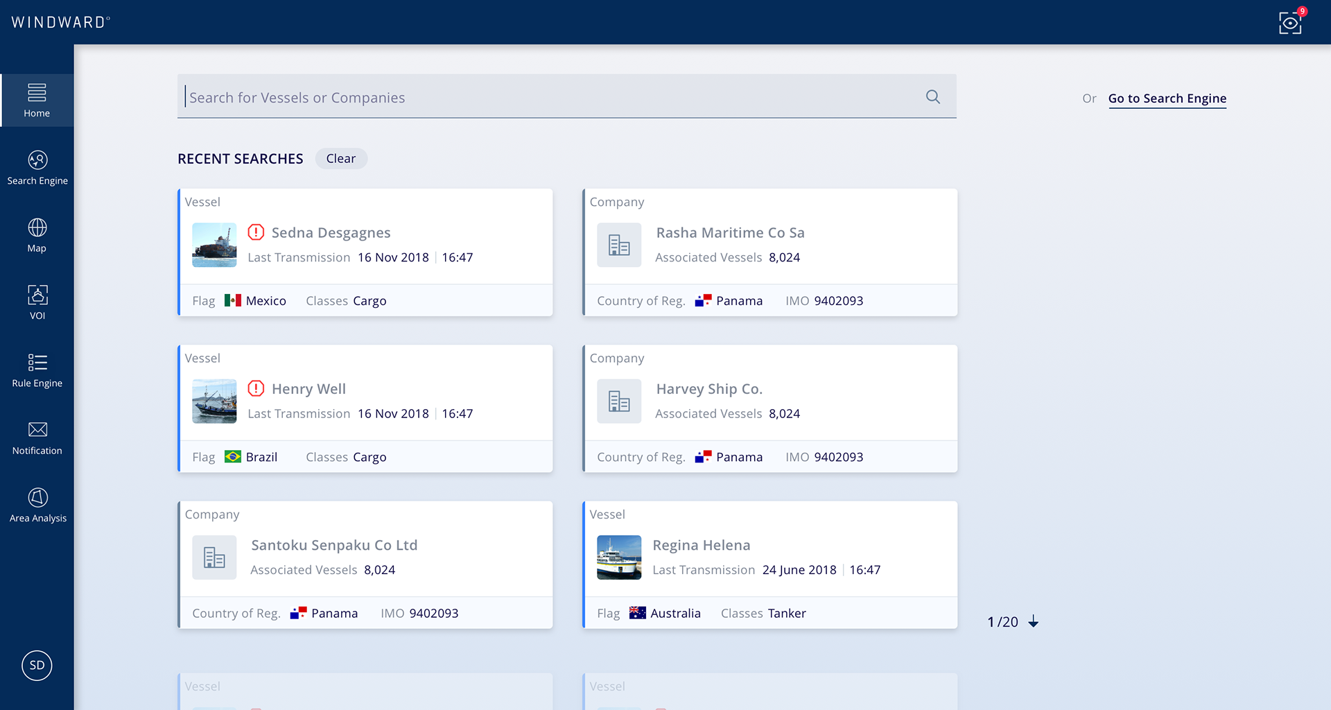
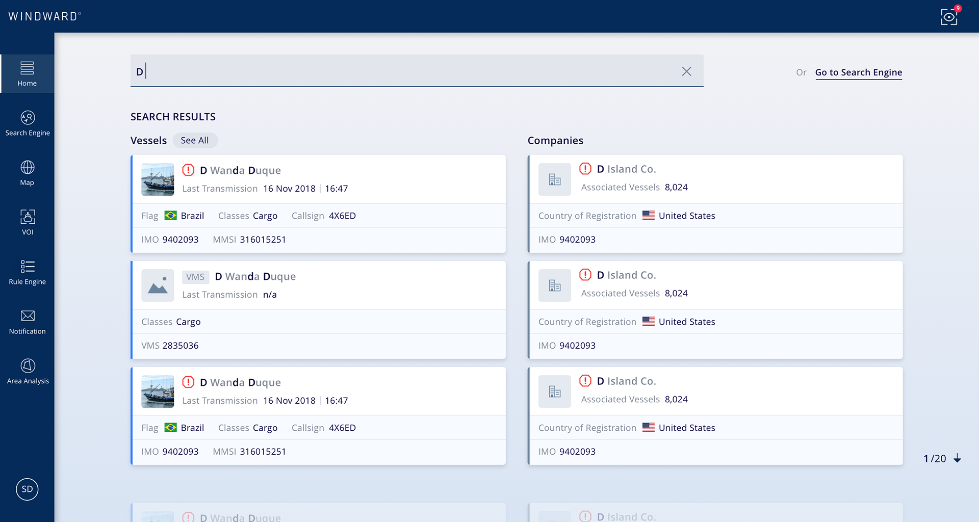
* Cards for results visualisation: These components are the entry point for the Vessel or Company page that display and group details of the result and share a common structure for easy scanning
* Guided navigation: 2 vertical categories, Vessels or Companies, to help the user browse the results more easily
* Recent Search: We know users come back to the same risky vessels multiple times so we added an easy shortcut to get back to previous searches and so navigate faster

01 - Home - Search - Landing

10 - Home - Search - Recent

20 - Home - Search - Results

30a - NAS - Search click
The Vessel page entity
Goal
The vessel page is a very central module that is included in every Windward package. In fact, the endpoint of the process leads to finding a specific vessel; i.e. the user eventually lands on that page and needs to understand what the vessel did to understand who he is.
The user should be able to open the page and get at a glance what is the problem with the vessel and what is the extent of that problem. So to provide immediate information for decision making depending on the different aspects of risk it was essential to bring forward the most relevant data point.
Challenges
* Outdated design: The design is based on old code in the system that did not reflect the new Design alignment, making it feel foreign from the rest of the system and technically hard to make any change.
* Too much information: We got from users that felt confused with too much information and too much to scroll with no idea where to start.
* Unusual UX pattern: Risk levels explanation building blocks were anchored down to the map. Such behaviour was confusing users.
* The map is the real focus: Another feedback showed us users were getting directly to the map, skipping the rest of the content.
* Same structure, different content: While the page shares the same structure across products it includes different content depending on the types of risk.
Design solutions
* Tabs - Introducing 360-view of risk for multiple products: Intelligence / Compliance / Insurance risk type, bringing more depth to that concept.
The Vessel page is where 2 different actors ‘Compliance’ (Sanction) and ‘Intelligence’ (Security) audience will look at different types of risk (‘Safety’ (Insurance) to be coming soon).
For instance, Energy companies who trade oil need to verify that vessels or companies are not under sanction, while Governments will be looking at potential smugglers, drugs or weapons trading.
Consequently, a tab solution to navigate between the different types of risk became a handy solution for addressing distinctly every target and providing different content from the same page entity.
* Risk levels explanation improvement: Keeping their level of importance high but making them clearer and more compact in order to push the map above the fold. Another addition was to add the number of this activity in other to add context.
* Making a connection between risk and map sections: Removing the inner anchor by defining the Risk indicators section and the map independent from each other. However, adding a compact visualisation of the risk indicators to the map to bring context.
* Map's timeline improvement: Fitting all events on the map.
* Drill-down for event details: An easy solution was to create a drill-down for every detail of events so the user would stay on the map while getting more information about a specific event.
* Flattening the risk (UX): Defining clear rules - The highest severity prevails across all types.
One Design System, two products
The 360-view of risk is an incentive from the company to unify its offering and provide in one place the relevant information for different audiences.
The company service is made of 2 distinct products, Intelligence and Insurance. However, while I was designing new features and optimizing existing ones for every product, I put effort into unifying these platforms both from a technical and business point of view through maintaining and developing a common Design System.